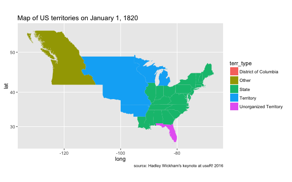
I wasn’t able to attend useR! 2016 last week. But thanks to Microsoft’s live streaming service, I was able to record a number of sessions and watch them over the holiday weekend. I am a frequent user of many of Hadley Wickham’s R packages. So of course I tuned in for his keynote. Hadley presented the following map, using historical data from the USAboundaries package. His point wasn’t about map making, per se – but rather about “tidy” principles for dealing with complex data structures (such as shape files or statistical models). I’m onboard with the #tidyverse. But I was also inspired by the map itself.
In honor of US Independence Day, I decided to build on Hadley’s example to make an animated map of US settlement. I don’t have many occasions to make maps as part of my current academic work. So I thought it would be fun to spend some time on the 4th of July learning to wrangle shape files in R.
Goals
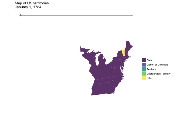
My primary goal was to make two maps:
- an animated map showing the settlement of US territories and the conversion of territories to states; and
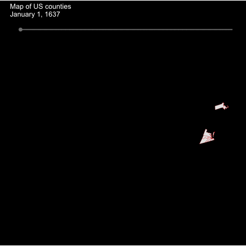
- an animated map showing the development of US counties.
Secondly, I wanted to focus the maps on the continental US, while still showing data from all regions. Repositioning / reprojecting Alaska and Hawaii is certainly not news. But for a newcomer to geospatial data, it was a data-munging benchmark that I needed to surpass.
Dataset
The USAboundaries package contains state/territory-level data from September 3, 1783 to December 31, 2000. So the state-level map will be a bit truncated historically – skipping over the early settlement of US colonies, as well as the declaration of the 13 original colonies as free and independent states in 1776(!). But alas, we’ll still have a nice bit of data to play with.
The county-level data in the USAboundaries package dates back about a century and a half further than the state-level data, all the way to December 30, 1636. So this dataset will provide a more extended view of US settlement history.
Maps
Here are the final results of my holiday weekend map-making expedition. Annotated R code to reproduce these maps is below.
The state-level map shows the United States on January 1st, every year from 1784 to 2000. (I grew up in Oklahoma – but I’d forgotten that there was a short period just before Oklahoma became a state in 1907 during which part of the region was an organized incorporated US territory and part was unorganized. This animated map reminded me of that fact).
The county-level map shows the United States on January 1st, every year from 1637 to 2000. One thing I like about this animation is that it highlights the degree of geographic separation during the early years of settlement.
R code
Data wrangling process
The heavy lifting is done by the get_boundaries() function defined below. This function uses the USAboundaries::us_boundaries() function to get (state- or county-level) shape files for a specified date, and then performs some additional processing to convert the shape file into a convenient format for plotting. The additional processing involves the following:
- extract metadata associated with each region (e.g., whether the region is an unorganized territory, state, etc.)
- project the coordinate system to Albers equal area
- reposition Alaska and Hawaii – I learned a lot about this from a helpful post by Bob Rudis, AKA @hrbrmstr.
- combine metadata with (repositioned) shape data
library(USAboundaries)  # contains data (shape files)
library(dplyr)          # for wrangling
library(lubridate)      # for wrangling dates
library(rgdal)          # for wrangling shape files / map data
library(maptools)       # for wrangling shape files / map data
library(ggplot2)        # for plotting
library(gganimate)      # for gif animation
library(viridis)        # for lovely color palettes

## ------------------------------------------------------------------------ ##
get_boundaries <- function(date, type = "state"){
  # Get shapefile for US states on specified date
  sp <- us_boundaries(as.Date(date), type = type)

  # Extract metadata. Includes info about the territory type for
  # each region (i.e., state, unorganized territory, etc.)
  metadata <- sp %>%
    as.data.frame() %>%
    mutate(id = as.character(id_num -1))# %>%
    # select(id, name, terr_type)

  # ----------------------------------------------
  # Convert coordinate system to Albers equal area,
  # and then reposition Alaska and Hawaii.
  #
  # thanks to Bob Rudis (hrbrmstr):
  # https://github.com/hrbrmstr/rd3albers
  sp_t <- spTransform(sp, CRS("+proj=laea +lat_0=45 +lon_0=-100 +x_0=0 +y_0=0 +a=6370997 +b=6370997 +units=m +no_defs"))
  rownames(sp_t@data) <- as.character(as.numeric(rownames(sp_t@data)) - 1)

  # extract, then rotate, shrink & move alaska (and reset projection)
  alaska <-
    if(type == "state"){
      sp_t[grep("Alaska", sp_t$full_name, fixed = TRUE),]
    } else if (type == "county"){
      sp_t[grep("Alaska", sp_t$state_terr, fixed = TRUE),]
    }

  alaska <- elide(alaska, rotate=-50)
  alaska <- elide(alaska, scale=max(apply(bbox(alaska), 1, diff)) / 2.3)
  alaska <- elide(alaska, shift=c(-2100000, -2500000))
  proj4string(alaska) <- proj4string(sp_t)

  # extract, then rotate & shift hawaii
  hawaii <-
    if(type == "state"){
      sp_t[grep("Hawaii", sp_t$full_name, fixed = TRUE),]
    } else if (type == "county"){
      sp_t[grep("Hawaii", sp_t$state_terr, fixed = TRUE),]
    }

  hawaii <- elide(hawaii, rotate=-35)
  hawaii <- elide(hawaii, shift=c(5400000, -1400000))
  proj4string(hawaii) <- proj4string(sp_t)

  # remove old states and put new ones back in
  sp_t <-
    if(type == "state"){
      sp_t[!grepl("Alaska|Hawaii", sp_t$full_name),]
    } else if(type == "county") {
      sp_t[!grepl("Alaska|Hawaii", sp_t$state_terr),]
    }

  sp_t <- rbind(sp_t, alaska, hawaii, makeUniqueIDs = TRUE)
  # ----------------------------------------------

  # get borders for each region
  borders <- sp_t %>%
    fortify() %>%
    as.data.frame() %>%
    mutate(year = year(date)) %>%
    left_join(metadata, by = "id")
}
The create_timeline() function creates the data needed to draw an animated timeline on the graphs. The input to this function is a dataframe containing lat/long info about the map to be plotted (e.g., the dataframe created by a call to get_boundaries()). The basic idea is to divide the x-axis range of the map (i.e., min and max longitude) into evenly spaced intervals, one for each year (since we’re animating by year). The resulting sequence provides the tick locations for the moving timeline tick point. And then we determine the vertical placement of the timeline by getting the max latitude of the map and adding a bit of padding.
create_timeline <- function(boundary_df){
  # determine how many year's worth of data will be plotted
  years <- unique(boundary_df$year)

  # create sequence that spans the width of the map (from min to max longitude),
  # with evenly spaced intervals for years
  timeline_range <- with(boundary_df,
                         seq(from = min(long),
                             to = max(long),
                             length.out = length(years)))

  # determine latitude coordinate for positioning timeline.
  # (max latitude * 1.2 places timeline just above map)
  timeline_y <- max(boundary_df$lat) * 1.2

  # collect timeline data into a df
  timeline <- data.frame(
    x = timeline_range,
    y = timeline_y,
    year = years
  )

  return(timeline)
}
With these two helper functions in hand, we can now get to the business of making the maps.
State-level map
# specify dates for which historic map data is to be gathered
state_dates <- seq(as.Date("1784-01-01"), as.Date("2000-01-01"), by = "year")

# for faster rendering, try plotting a reduced date range
# state_dates <- seq(as.Date("1784-01-01"), as.Date("1789-01-01"), by = "year")

# get state-level data for every date, bind all data into one df,
# and set factor levels for territory type
states <- lapply(state_dates,
                 function(x) get_boundaries(x, type = "state")) %>%
  do.call(rbind, .) %>%
  mutate(
    terr_type = factor(terr_type,
                       levels = c("State",
                                  "District of Columbia",
                                  "Territory",
                                  "Unorganized Territory",
                                  "Other")))


# create timeline for state data
state_timeline <- create_timeline(states)


# plot the map
p_state <- ggplot() +
  # Add territory polygons
  geom_polygon(aes(x = long, y = lat, group = group, fill = terr_type, frame = year),
               data = states,
               alpha = 0.8) +

  # Add timeline
  geom_segment(aes(x = min(x), xend = max(x),
                   y = y, yend = y,
                   frame = year),
               data = state_timeline,
               colour = "grey50", size = 1) +
  geom_point(aes(x = x, y = y, frame = year),
             data = state_timeline,
             colour = "grey50", size = 3) +

  # styling
  coord_equal() +
  scale_fill_viridis(discrete = TRUE) +
  labs(title = "Map of US territories\nJanuary 1,",
       fill = "") +
  theme_minimal() +
  theme(panel.grid = element_blank(),
        axis.text = element_blank(),
        axis.title = element_blank())

gg_animate(p_state, interval = 0.1)
County-level map
# specify dates for which historic map data is to be gathered
county_dates <- seq(as.Date("1637-01-01"), as.Date("2000-01-01"), by = "year")

# get county data for specified date range
counties <- lapply(county_dates,
                   function(x) get_boundaries(x, type = "county")) %>%
  do.call(rbind, .)


# create timeline
county_timeline <- create_timeline(counties)


# make the plot
p_counties <- ggplot() +
  # Add county polygons
  geom_polygon(aes(x = long, y = lat, group = group, frame = year),
               data = counties,
               colour = "red", fill = "grey90", size = .1) +

  # Add timeline
  geom_segment(aes(x = min(x), xend = max(x),
                   y = y, yend = y,
                   frame = year),
               data = county_timeline,
               colour = "grey50", size = 1) +
  geom_point(aes(x = x, y = y, frame = year),
             data = county_timeline,
             colour = "grey50", size = 3) +

  # Styling
  coord_equal() +
  labs(title = "Map of US counties\nJanuary 1,") +
  theme_minimal() +
  theme(panel.grid = element_blank(),
        axis.text = element_blank(),
        axis.title = element_blank(),
        plot.title = element_text(colour = "white"),
        legend.text = element_text(colour = "white"),
        plot.background = element_rect(fill = "black"))

# animate the plot
gg_animate(p_counties, interval = 0.1)
Final notes
The Rmd file used to create this report is available here.
Note that if you run this code on a standard laptop, it will likely take several (5-15) minutes to make each map due to the amount of data that is prepped + rendered. The county map is particularly slow because the data frame contains more than 11 million rows and the gif contains nearly 400 frames (one frame per year from 1636–2000).
My approach here (and in general) was desired output first, optimize later, especially since I’m new to map making. If you just want to play around with the code and see immediate results, I would start by reducing the date range to a handful of years, which will dramatically speed up the data prep + rendering process.
Also, I just learned about the new rmapshaper package, which might be one way to improve rendering speed at scale. This package performs multi-polygon simplification by removing overlapping boundaries between adjacent polygons. Maybe I’ll try that out in a later post.
Comments are always welcome!
comments powered by Disqus