An Introduction to ggplot for Linguists
Kodi Weatherholtz
kweatherholtz@ling.ohio-state.edu
This tutorial is a work in progress
-
last update: 5/23/2013
-
Feel free to email me with questions, comments, suggestions, or corrections.
Structure of this tutorial
-
Getting Started
-
conceptual overview of ggplot, and some basic plots
-
adding regression lines and other basic embellishments
-
grouping and statistically transforming data
-
cosmetic details (e.g., colour, legends, axis labels)
-
Visualizing Linguistic Data
-
formant data and vowel plots
-
barplots, lineplots, and error bars
-
binomial variables and plotting proportions
-
geospatial plotting and possibilities for students of variation
What is ggplot?
“ggplot2 is a plotting system for R, based on the grammar of graphics, which tries to take the good parts of base and lattice graphics and none of the bad parts. It takes care of many of the fiddly details that make plotting a hassle (like drawing legends) as well as providing a powerful model of graphics that makes it easy to produce complex multi-layered graphics.”
Hadley Wickham, developer, http://ggplot2.org/
Conceptual overview
“ggplot2 is designed to work in a layered fashion, starting with a layer showing the raw data then adding layers of annotations and statistical summaries.”
Wickham, 2009, ggplot2: Elegant Graphics for Data Analysis
in base R:
– graphics are composed of simple raw elements (e.g., points, lines)
– it is difficult to add new components to existing graphics (e.g., error bars, legends)
ggplot:
– graphics involve high-level elements (representations of raw data, statistical transformations)
– elements are easily combined to form complex graphics
Getting setup
## even if you already have ggplot installed, you should reinstall it, as some
## function and argument names have changed with the release of version 9.2

# install.packages('ggplot2')
require(ggplot2)
Basic Examples
-
ggplot syntax
-
some simple plots
-
combining geoms to create multi-layered plots
A call to ggplot minimally consists of…
a data frame
a set of aesthetic mappings
– describe how variables in a data frame are mapped to graphical attributes
– x- and y-axis variables, colo(u)rs, subset groupings, linetypes
one or more geometric objects , called geoms
– determine how values are rendered graphically
– points, lines, boxplots, bars, etc.
- For example:
– ggplot(dataframe, aes(x = xvar, y = yvar)) + geom_boxplot()
Additionally, it is possible to specify…
statistical transformations, called stats
– e.g., regression lines, bootstrapped confidence intervals, log transform of scale and coordinate systems
one or more facets to create lattice/trellis plots
– e.g., plot each subject’s data individually
a coordinate system, or coord
– default is Cartesian coordinates, but other systems can be specified
– e.g., polar coords, log transformed coords, map projections (latitude and longitude)
scales
– e.g., adjust size of points in a scatterplot to be proportional on a specified scale
Let’s start with a simple data set
# mtcars is a built in data set.
head(mtcars)
                   mpg cyl disp  hp drat    wt  qsec vs am gear carb
Mazda RX4         21.0   6  160 110 3.90 2.620 16.46  0  1    4    4
Mazda RX4 Wag     21.0   6  160 110 3.90 2.875 17.02  0  1    4    4
Datsun 710        22.8   4  108  93 3.85 2.320 18.61  1  1    4    1
Hornet 4 Drive    21.4   6  258 110 3.08 3.215 19.44  1  0    3    1
Hornet Sportabout 18.7   8  360 175 3.15 3.440 17.02  0  0    3    2
Valiant           18.1   6  225 105 2.76 3.460 20.22  1  0    3    1
# Let's tidy it up a bit
# turn rownames (car model) into vector, and select a subset of columns
df1 <- data.frame(model = as.factor(row.names(mtcars)),
                  mtcars[,c(11,1:2,4,6)])
row.names(df1) <- NULL

head(df1)
              model carb  mpg cyl  hp    wt
1         Mazda RX4    4 21.0   6 110 2.620
2     Mazda RX4 Wag    4 21.0   6 110 2.875
3        Datsun 710    1 22.8   4  93 2.320
4    Hornet 4 Drive    1 21.4   6 110 3.215
5 Hornet Sportabout    2 18.7   8 175 3.440
6           Valiant    1 18.1   6 105 3.460
A simple “scatterplot”
ggplot(data = df1, aes(x = cyl, y = mpg, group = cyl)) +
  geom_point()
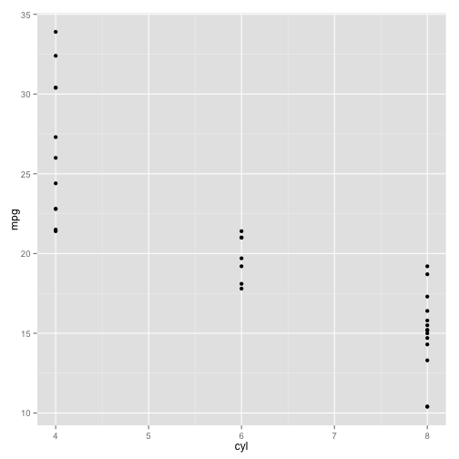
Not the right representation…
-
the x-axis variable (number of cylinders) is not a continuous variable, so the data aren’t “scattered”
-
hence, a scatterplot isn’t the most appropriate visualization
-
let’s change the geom to see different visualizations
A simple boxplot
ggplot(data = df1, aes(x = cyl, y = mpg, group = cyl)) +
  geom_boxplot()

A simple violin plot
ggplot(data = df1, aes(x = cyl, y = mpg, group = cyl)) +
  geom_violin()

Define theme for easy use later
my.theme <- theme(axis.text = element_text(colour="black", size=15),
                  text = element_text(size=16),
                  title = element_text(size=19),
                  axis.title.x=  element_text(vjust=-0.45),
                  axis.title.y = element_text(vjust=.2),
                  axis.ticks = element_line(colour="black"),
                  axis.line = element_line())
Combining geoms
ggplot(data = df1, aes(x = cyl, y = mpg, group = cyl)) +
  geom_violin() +
  geom_point() + # add a layer showing raw data points
  my.theme # use the custom theme we just defined

Adjust parameters of one layer independently
ggplot(data = df1, aes(x = cyl, y = mpg, group = cyl)) +
  geom_violin() +
  geom_point(position=position_jitter(width=.1)) + # add jitter to points
  my.theme

Try a different representation of points
ggplot(data = df1, aes(x = cyl, y = mpg, group = cyl)) +
  geom_violin() +
  geom_dotplot(binaxis = "y", stackdir = "center") + # specify which axis to use for 'binning'
  my.theme

… so, those dots were a little big
ggplot(data = df1, aes(x = cyl, y = mpg, group = cyl)) +
  geom_violin() +
  geom_dotplot(binaxis = "y", stackdir = "center", dotsize = .65) + # change size of dots
  my.theme

Basic Embellishments
-
add means to boxplots
-
add regression lines to scatterplots
-
annotate plots with text (e.g., regression statistics)
Box and scatterplots revisited
by definition, boxplots display median and interquartile ranges, but not means
– ggplots are built in layers, so it’s easy to add a layer for descriptive statistics like means
scatterplots display values for multiple continuous variables
– it’s also easy to add a regression line to show direction and size of correlation
all plots can be annotated with text
Add descriptive stats to boxplots
ggplot(data = df1, aes(x = cyl, y = mpg, group = cyl)) +
  geom_boxplot() +
  # fun.y=mean calculates the mean of the y-axis variable (mpg) for each group.
  # geom="point" indicates means should be plotted as points over top of the boxplots.
  stat_summary(fun.y = mean, geom = "point", color = "red", size = 3) +
  my.theme

Scatterplot with loess-smoothed curve and labelled axes
ggplot(data = df1, aes(x = hp, y = wt)) +
  geom_point() + # make scatterpot
  geom_smooth() + # add loess line
  scale_x_continuous("gross horsepower") + # change axis labels and limits
  scale_y_continuous("weight (lb/1000)", limits = c(1,6)) +
  my.theme
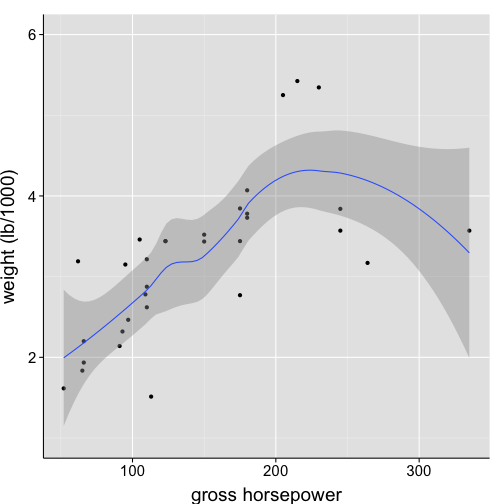
-
by default, error ribbons depict point-wise 95% confidence intervals
Remove error ribbon
ggplot(data = df1, aes(x = hp, y = wt)) +
  geom_point() +
  geom_smooth(se = FALSE) + # remove error ribbon
  scale_x_continuous("gross horsepower") +
  scale_y_continuous("weight (lb/1000)", limits = c(1,6)) +
  my.theme

Change error ribbon to pointrange
ggplot(data = df1, aes(x = hp, y = wt)) +
  geom_point() +
  stat_smooth(geom = "pointrange") + # note the change to stat_smooth()
  scale_x_continuous("gross horsepower") +
  scale_y_continuous("weight (lb/1000)", limits = c(1,6)) +
  my.theme

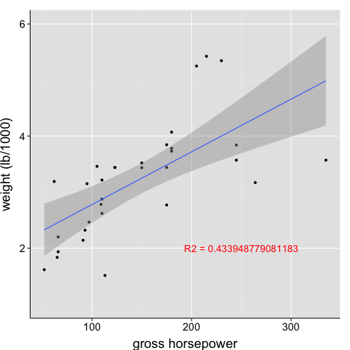
Plot a linear best-fit line instead of a nonlinear curve
ggplot(data = df1, aes(x = hp, y = wt)) +
  geom_point() +
  geom_smooth(method = "lm", formula = y~(x)) +
  scale_x_continuous("gross horsepower") +
  scale_y_continuous("weight (lb/1000)", limits = c(1,6)) +
  my.theme

Annotate the plot
ggplot(data = df1, aes(x = hp, y = wt)) +
  geom_point() +
  geom_smooth(method = "lm", formula = y~(x)) +
  scale_x_continuous("gross horsepower") +
  scale_y_continuous("weight (lb/1000)", limits = c(1,6)) +
  # specify the text (i.e., label) and the x- and y-coordinates for text placement
  annotate(geom = "text", x = 250, y = 2, label = "R2 = ???, p = ???", color = "red") +
  my.theme

The problem of annotating plots manually…
if your data set is continually changing (say, as you run more participants), you must continually hand correct the annotations
this is cumbersome, and it’s easy to make mistakes
SOLUTION: supply the label argument with output directly from regression model
let’s see an example
First, examine the model plotted by geom_smooth
# Recall, we had previously specified geom_smooth(method='lm', formula=y~(x)).
# The call below produces the same model, just outside of ggplot.
my.model <- summary(lm(wt ~ hp, data = df1))
print(my.model)
Call:
lm(formula = wt ~ hp, data = df1)

Residuals:
    Min      1Q  Median      3Q     Max
-1.4176 -0.5312 -0.0204  0.4254  1.5645

Coefficients:
            Estimate Std. Error t value Pr(>|t|)
(Intercept)  1.83825    0.31652    5.81  2.4e-06 ***
hp           0.00940    0.00196    4.80  4.1e-05 ***
---
Signif. codes:  0 '***' 0.001 '**' 0.01 '*' 0.05 '.' 0.1 ' ' 1

Residual standard error: 0.748 on 30 degrees of freedom
Multiple R-squared: 0.434,  Adjusted R-squared: 0.415
F-statistic:   23 on 1 and 30 DF,  p-value: 4.15e-05
Now, annotate plot with this model output
ggplot(data = df1, aes(x = hp, y = wt)) +
  geom_point() +
  geom_smooth(method = "lm", formula = y~(x)) +
  scale_x_continuous("gross horsepower") +
  scale_y_continuous("weight (lb/1000)", limits = c(1,6)) +
  # We no longer specify the annotation text locally.
  # The text comes directly from the regression model.
  annotate(geom = "text", x = 250, y = 2, label = my.exp, color = "red")+
  my.theme
Advanced annotation strategy
ggplot(data = df1, aes(x = hp, y = wt)) +
  geom_point() +
  geom_smooth(method = "lm", formula = y~(x)) +
  scale_x_continuous("gross horsepower") +
  scale_y_continuous("weight (lb/1000", limits = c(1,6)) +
  annotate(geom = "text", x = 250, y = 2, label = lm_eqn(df1), parse = T, color = "red") +
  my.theme

Grouping and Statistically Transforming Data
-
log transformations
-
add regresssion lines in log space
-
add separate regression lines for data subsets
-
histograms, density distributions, and faceting
Let’s use a larger data set
df2 <- subset(diamonds, carat > 0.5)

head(df2)
   carat       cut color clarity depth table price    x    y    z
91  0.70     Ideal     E     SI1  62.5    57  2757 5.70 5.72 3.57
92  0.86      Fair     E     SI2  55.1    69  2757 6.45 6.33 3.52
93  0.70     Ideal     G     VS2  61.6    56  2757 5.70 5.67 3.50
94  0.71 Very Good     E     VS2  62.4    57  2759 5.68 5.73 3.56
95  0.78 Very Good     G     SI2  63.8    56  2759 5.81 5.85 3.72
96  0.70      Good     E     VS2  57.5    58  2759 5.85 5.90 3.38
nrow(df2)
[1] 35008
A linear best-fit line, again
ggplot(data = df2, aes(x = carat, y = price)) +
  geom_point() +
  geom_smooth(method = "lm") +
  scale_x_continuous("carat") +
  scale_y_continuous("price")+
  my.theme

Use color to depict subset groupings
ggplot(data=df2, aes(x=carat, y=price, colour=cut, fill=cut)) +
  geom_point() +
  geom_smooth(method = "lm") +
  coord_trans(x = "log10", y = "log10") +
  scale_x_continuous("log10(carat)") +
  scale_y_continuous("log10(price)") +
  my.theme

Adjust the alpha transparency of points
ggplot(data=df2, aes(x=carat, y=price, colour=cut, fill=cut)) +
  geom_point(alpha = .05) + # number btw 0 (transparent) and 1 (opaque)
  geom_smooth(method = "lm") +
  coord_trans(x = "log10", y = "log10") +
  scale_x_continuous("log10(carat)") +
  scale_y_continuous("log10(price)") +
  my.theme

Reverse legend so order better matches plot
ggplot(data=df2, aes(x=carat, y=price, colour=cut, fill=cut)) +
  geom_point(alpha = .05) +
  geom_smooth(method = "lm") +
  coord_trans(x = "log10", y = "log10") +
  scale_x_continuous("log10(carat)") +
  scale_y_continuous("log10(price)") +
  guides(fill = guide_legend(reverse = TRUE), colour = guide_legend(reverse = TRUE)) +
  my.theme

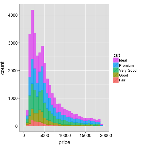
Histogram
# plot number of tokens (counts) that fall within a specific bin
ggplot(data=df2, aes(x=price, fill=cut, colour=cut)) +
  geom_histogram(alpha=.8) +
  guides(fill = guide_legend(reverse = TRUE), colour = guide_legend(reverse = TRUE)) +
  my.theme
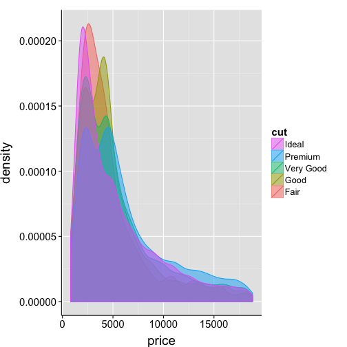
Density distribution
# plot the probability that a variable will take on a given value
ggplot(data=df2, aes(x=price, fill=cut, colour=cut)) +
  geom_density(alpha=.5) +
  guides(fill = guide_legend(reverse = TRUE), colour = guide_legend(reverse = TRUE)) +
  my.theme
Histogram overlaid with density distribution
# the trick here is to change the y-axis for the histrogram
# from counts to probability density
ggplot(data=df2, aes(x=price)) +
  geom_histogram(aes(y=..density..), alpha=.5) +
  geom_density(size=1.25) +
  my.theme

Adjust the bandwidth for the kernel density estimation
ggplot(data=df2, aes(x=price)) +
  geom_histogram(aes(y=..density..), alpha=.5) +
  geom_density(size=1.25, adjust=1.9) +
  my.theme

Map a color gradient to counts
ggplot(data=df2, aes(x=price, fill=..count..)) +
  geom_histogram() +
  scale_fill_continuous(low="violet", high="violetred4") +
  my.theme

Histograms split by variable
# define subset for easy reference
df2.sub <- subset(df2, cut %in% c("Ideal","Good") & price < 8000)

ggplot(data=df2.sub, aes(x=price, colour=cut)) +
  geom_histogram(aes(y=..density.., fill=cut), alpha=.3) +
  geom_density(size=1.5) +
  facet_grid(cut ~ .) +
  my.theme

Embellish histograms
# calculate means of each group
df2.sub.means <- ddply(df2.sub, .(cut),
                   summarise, mean.price=mean(price))
Error: could not find function "ddply"
print(df2.sub.means)
Error: object 'df2.sub.means' not found
ggplot(data=df2.sub, aes(x=price, colour=cut)) +
  geom_histogram(aes(y=..density.., fill=cut), alpha=.3) +
  geom_density(size=1.5) +
  geom_vline(data=df2.sub.means, aes(xintercept=mean.price),
             linetype="dashed", size=1, colour="red") + # add means as dashed lines
  facet_grid(cut ~ .) + # plot subgroups as separate "facets"
  my.theme
Error: object 'df2.sub.means' not found
Some Cosmetic Details
-
using colo(u)r in plots
-
control legend and axis formatting
Color palettes

ggplot color selection – maximal dispersion

Number of factor levels determines colors
ggplot(mtcars, aes(x = factor(cyl), fill = factor(cyl))) +
  geom_bar() +
  my.theme

ggplot(mpg, aes(x = trans, fill = trans)) +
  geom_bar() +
  my.theme

Change color palette using color names
ggplot(mtcars, aes(x = factor(cyl), fill = factor(cyl))) +
  geom_bar() +
  scale_fill_manual(values=c("red", "green", "blue")) +
  my.theme

Change color palette using hexidecimal notation
ggplot(mtcars, aes(x = factor(cyl), fill = factor(cyl))) +
  geom_bar() +
  scale_fill_manual(values=c("#980000", "#009800", "#000098")) +
  my.theme

Use pre-defined palette from RColorBrewer
ggplot(mtcars, aes(x = factor(cyl), fill = factor(cyl))) +
  geom_bar() +
  scale_fill_brewer() +
  my.theme

RColorBrewer has many pre-defined palettes
Select specific palette from RColorBrewer
ggplot(mtcars, aes(x = factor(cyl), fill = factor(cyl))) +
  geom_bar() +
  scale_fill_brewer(palette="YlOrRd")+
  my.theme

Render image in grayscale
ggplot(mtcars, aes(x = factor(cyl), fill = factor(cyl))) +
  geom_bar() +
  scale_fill_grey() +
  my.theme

Change legend name
ggplot(mtcars, aes(x = factor(cyl), fill = factor(cyl))) +
  geom_bar() +
  scale_fill_grey("Cylinders") +
  my.theme

Every element in a plot is customizable
ggplot(mtcars, aes(x = factor(cyl), fill = factor(cyl))) +
  geom_bar() +
  scale_fill_grey("Cylinders") +
  theme(legend.position="bottom",              # move legend below x-axis
        legend.title = element_text(colour="red", face="italic", size=19),
        legend.text = element_text(size=17),
        axis.text.x = element_text(colour="red", face="bold", size=17),
        axis.title.x = element_blank(),        # remove x-axis label
        panel.background = element_blank(),     # remove panel grid
        axis.line = element_line()  # add 'l-shaped' axis line
        )

Linguistic Data
Part 1: Formant Values and Vowel Plots
Peterson and Barney (1952) vowel data
# acoustic measurements of 8 reps of 10 vowels from 72 speakers (adults and
# children)
pb <- read.delim("http://ling.upenn.edu/courses/cogs501/pb.Table1", header = FALSE)

# Give meaningful column names
colnames(pb) <- c("Age", "Sex", "Speaker", "Vowel", "V1", "F0.hz", "F1.hz", "F2.hz",
    "F3.hz")

# Relabel the age data
levels(pb$Age) <- c("Child", "Adult", "Adult")
pb$Age <- relevel(pb$Age, "Adult")

# Clean up speaker labeling
pb$Speaker <- as.factor(paste("S", pb$Speaker, sep = ""))

head(pb)
    Age Sex Speaker Vowel   V1 F0.hz F1.hz F2.hz F3.hz
1 Adult   m      S1    iy    i   160   240  2280  2850
2 Adult   m      S1    iy    i   186   280  2400  2790
3 Adult   m      S1    ih \\ic   203   390  2030  2640
4 Adult   m      S1    ih \\ic   192   310  1980  2550
5 Adult   m      S1    eh \\ep   161   490  1870  2420
6 Adult   m      S1    eh \\ep   155   570  1700  2600
A vowel plot of one speaker’s data
# note we can select a subset from within the call to ggplot
ggplot(data=subset(pb, Speaker=="S2"), aes(x=F2.hz, y=F1.hz, label=Vowel)) +
  geom_point() +
  geom_text() +  # geom_text() labels points. Label must be specified as an aesthetic
  scale_y_reverse() +   # reverse the axes
  scale_x_reverse() +
  my.theme

Label placement was bad on that last one. Let’s fix it!
# note we can select a subset from within the call to ggplot
ggplot(data=subset(pb, Speaker=="S2"), aes(x=F2.hz, y=F1.hz, label=Vowel)) +
  geom_point() +
  geom_text(hjust=1.1, vjust=-.2, size=5.5) + # adjust placement and size of labels
  scale_y_reverse() +
  scale_x_reverse() +
  my.theme

Plot multiple speakers individually
ggplot(data=subset(pb, Speaker %in% c("S1","S2","S3","S4")), aes(x=F2.hz, y=F1.hz, label=Vowel)) +
  geom_text(hjust=1, vjust=-.2) +
  scale_y_reverse() +
  scale_x_reverse() +
  facet_wrap(~ Speaker) + # this line provides functionality similar to the lattice package
  my.theme

More complex faceting
ggplot(data=pb, aes(x=F2.hz, y=F1.hz, label=Vowel, colour=Vowel)) +
  geom_text(hjust=1, vjust=-.2) +
  scale_y_reverse() +
  scale_x_reverse() +
  facet_wrap(~ Sex + Age) + # specify multiple variables for faceting
  my.theme

Note: some male-adult values are being cut off
Adjust range of reversed axes
ggplot(data=pb, aes(x=F2.hz, y=F1.hz, label=Vowel, colour=Vowel)) +
  geom_text(hjust=1, vjust=-.2) +
  scale_y_reverse() +
  scale_x_reverse() +
  coord_cartesian(ylim=c(0, 1500)) +
  facet_wrap(~ Sex + Age) +
  my.theme

There are many ways to adjust axis limits, but when axes are reversed, it’s best to use coord_cartesian()
Plot all females by age
ggplot(data=subset(pb, Sex=="f"), aes(x=F2.hz, y=F1.hz, label=Vowel, colour=Age)) +
  geom_text() +
  scale_y_reverse() +
  scale_x_reverse() +
  my.theme

Wouldn’t it be cool if…
… we could plot shaded regions showing the total area of the child’s formant space vs. the adult’s space?
as it turns out, geom_polygon can do just that
first, we just need to find the envelope (i.e., convex hull) for adults and children
Convex hulls
require(plyr)
# chull() is a function for finding the 'envelope' of a set of data points.
# Here we use this function to find the extreme points for a 2-dimensional
# space (F1-F2)
find_hull <- function(df) {
    df[chull(df$F2.hz, df$F1.hz), ]
}

# apply this function to find the envelope for females by Age (adult vs.
# children)
hulls <- ddply(subset(pb, Sex == "f"), .(Age), find_hull)

print(hulls)
     Age Sex Speaker Vowel   V1 F0.hz F1.hz F2.hz F3.hz
1  Adult   f     S54    iy    i   220   220  2850  3800
2  Adult   f     S37    ah \\vt   213   280   850  2500
3  Adult   f     S61    ah \\vt   260   290   670  2380
4  Adult   f     S61    ah \\vt   275   330   630  2460
5  Adult   f     S59    uh \\hs   246   420   590  3100
6  Adult   f     S58    ao \\ct   250   950  1130  3160
7  Adult   f     S53    ao \\ct   267   987  1172  3180
8  Adult   f     S40    ao \\ct   180  1040  1300  3000
9  Adult   f     S48    ae \\ae   222  1110  2160  2700
10 Adult   f     S40    iy    i   200   300  3100  3400
11 Child   f     S63    iy    i   290   320  3500  4260
12 Child   f     S68    ah \\vt   260   310   730  3500
13 Child   f     S68    ah \\vt   274   360   660  3050
14 Child   f     S62    ah \\vt   200   400   650  3800
15 Child   f     S66    uh \\hs   285   770   940  3750
16 Child   f     S76    ao \\ct   350  1190  1470  3150
17 Child   f     S62    ao \\ct   200  1300  1800  3450
18 Child   f     S67    ae \\ae   214  1240  2700  3640
19 Child   f     S67    iy    i   227   590  3610  4220
Using convex hulls in plots
ggplot(data=subset(pb, Sex=="f"), aes(x=F2.hz, y=F1.hz, label=Vowel, colour=Age, fill=Age)) +
  geom_text() +
  geom_polygon(data=hulls, alpha=.4) +
  scale_y_reverse() +
  scale_x_reverse() +
  my.theme

Linguistic Data
Part 2: Response Times, Barplots, and Error Bars
A conceptual overview for…
-
… plotting mean RTs with error bars showing standard error of the mean
-
calculate mean RT for each condition for each subject
-
calculate condition grand mean RTs by averaging over subject-wise means
-
calculate std.error over subject-wise means, resulting in standard error of the mean
-
then plot (2) and (3) using geom_bar() and geom_errorbar()
One way to calculate standard error of the mean
standard error of the mean equals std. deviation (\(\sigma\)) divided by the square root of the sample size (N)
\[ SE_{\bar{x}} = \sigma / \sqrt{N} \]
which is equivalent to square root of variance (\(s^2\)) divided by square root of sample size (N)
\[ \sqrt{s^2 / N} \]
std.error <- function(x, na.rm = T) {
    sqrt(var(x, na.rm = na.rm)/length(x[complete.cases(x)]))
}
A fake data set
# read in fake data
rt.dat <- read.delim("datasets/fakedata.txt", header = T)

head(rt.dat)
  Subject Item IV1 IV2 Response Freq   RT
1      S1 t_01   A   2        1 0.24 1100
2      S1 t_02   A   2        1 5.22  983
3      S1 t_03   A   2        1 5.10 1108
4      S1 t_04   A   2        1 5.77  984
5      S1 t_05   A   2        1 2.37 1340
6      S1 t_06   A   2        1 5.80 1192
# How many data points per subjet per condition
table(rt.dat$IV1, rt.dat$IV2)/length(unique(rt.dat$Subject))
    2 3 4
  A 8 8 8
  B 8 8 8
Calculate subject-wise condition means
require(plyr)

# use ddply() to calculate condition means for each subject, averaging over items
mean.bySubj <- ddply(rt.dat, .(Subject, IV1, IV2), summarise,
                     "mean.RT" = mean(RT))

head(mean.bySubj, 18)
   Subject IV1 IV2 mean.RT
1       S1   A   2    1150
2       S1   A   3    1309
3       S1   A   4    1453
4       S1   B   2    1067
5       S1   B   3    1479
6       S1   B   4    1694
7      S10   A   2    1245
8      S10   A   3    1318
9      S10   A   4    1636
10     S10   B   2    1136
11     S10   B   3    1467
12     S10   B   4    1914
13     S11   A   2    1234
14     S11   A   3    1418
15     S11   A   4    1679
16     S11   B   2    1102
17     S11   B   3    1435
18     S11   B   4    1894
Calculate grand means and std.error of the mean
grand.means <- ddply(mean.bySubj, .(IV1, IV2), summarise,
                     "grand.RT" = mean(mean.RT),
                     "se" = std.error(mean.RT))

print(grand.means)
  IV1 IV2 grand.RT    se
1   A   2    713.9 76.75
2   A   3    885.9 76.33
3   A   4   1152.3 77.98
4   B   2    721.9 74.06
5   B   3   1019.1 81.86
6   B   4   1445.9 77.44
Bar plot showing group means and standard error
ggplot(data = grand.means, aes(x = factor(IV2), y = grand.RT, fill = IV1)) +
  geom_bar(position = position_dodge(.9)) + # position bars side-by-side (cf. stacked)
  geom_errorbar(position = position_dodge(.9), width = .25,
                aes(ymin = grand.RT-se, ymax = grand.RT+se)) + # ymax and ymin are group mean +/- std. error
  my.theme

Change linetype
ggplot(data = grand.means, aes(x = factor(IV2), y=grand.RT, group=IV1, colour=IV1)) +
  geom_point() +
  geom_line(linetype="dashed") +
  geom_errorbar(width = .15, aes(ymin = grand.RT-se, ymax = grand.RT+se)) +
  my.theme

A Brief Digression – Or, Why Averaging over Subjects is Crucial: A Story in Two Parts
# immediately calculate condition means and error from raw data,
# without first averaging over subjs
means.wrong <- ddply(rt.dat, .(IV1, IV2), summarise, "mean.RT" = mean(RT))
error.wrong <- ddply(rt.dat, .(IV1,IV2), summarise, "se" = std.error(RT))

# merge means and error into one frame
wrong.grand <- merge(means.wrong, error.wrong, by=c("IV1", "IV2"), all=T)

print(wrong.grand)
  IV1 IV2 mean.RT    se
1   A   2   713.9 28.56
2   A   3   885.9 29.06
3   A   4  1152.3 30.37
4   B   2   721.9 27.55
5   B   3  1019.1 31.51
6   B   4  1445.9 32.02
- now let’s visually compare these error values to the previously calculated standard error of the mean
Why averaging over subjects is crucial, cont’d.

What happened?
The error bars became substantially smaller. Why?
Recall that when calculating standard error of the mean correctly, the denominator is the sample size of the data set (e.g., number of participants)
Hence, we want to calculate error using a data frame containing one data point per subject per condition (i.e., each subject’s mean performance in that condition)
If we calculate standard error over the whole data set (as in the second example above), instead of over subject means, then the denominator is huge! Which leads to a tiny error measurement.
Linguistic Data
Part 3: Binomial DVs and Proportions
The lexdec data set
## lexdec is a canned lexical decision data set from Harold Baayen and Jen Hay
## available in the package languageR

# install.packages('languageR')
require(languageR)

# numeric coding of of whether response was correct or incorrect
lexdec$Correct.num <- ifelse(lexdec$Correct == "correct", 1, 0)

# simplify column names
colnames(lexdec)[c(5, 10)] <- c("NativeLang", "Freq")

# select specific subset for illustrative purposes
subjs <- c("A1", "A2", "C", "K", "R3", "S", "T1", "J", "M2", "T2", "V", "Z")
lex.sub <- subset(lexdec, Subject %in% subjs)

str(lex.sub)
'data.frame':   948 obs. of  29 variables:
 $ Subject     : Factor w/ 21 levels "A1","A2","A3",..: 1 1 1 1 1 1 1 1 1 1 ...
 $ RT          : num  6.34 6.31 6.35 6.19 6.03 ...
 $ Trial       : int  23 27 29 30 32 33 34 38 41 42 ...
 $ Sex         : Factor w/ 2 levels "F","M": 1 1 1 1 1 1 1 1 1 1 ...
 $ NativeLang  : Factor w/ 2 levels "English","Other": 1 1 1 1 1 1 1 1 1 1 ...
 $ Correct     : Factor w/ 2 levels "correct","incorrect": 1 1 1 1 1 1 1 1 1 1 ...
 $ PrevType    : Factor w/ 2 levels "nonword","word": 2 1 1 2 1 2 2 1 1 2 ...
 $ PrevCorrect : Factor w/ 2 levels "correct","incorrect": 1 1 1 1 1 1 1 1 1 1 ...
 $ Word        : Factor w/ 79 levels "almond","ant",..: 55 47 20 58 25 12 71 69 62 1 ...
 $ Freq        : num  4.86 4.61 5 4.73 7.67 ...
 $ FamilySize  : num  1.386 1.099 0.693 0 3.135 ...
 $ SynsetCount : num  0.693 1.946 1.609 1.099 2.079 ...
 $ Length      : int  3 4 6 4 3 10 10 8 6 6 ...
 $ Class       : Factor w/ 2 levels "animal","plant": 1 1 2 2 1 2 2 1 2 2 ...
 $ FreqSingular: int  54 69 83 44 1233 26 50 63 11 24 ...
 $ FreqPlural  : int  74 30 49 68 828 31 65 47 9 42 ...
 $ DerivEntropy: num  0.791 0.697 0.475 0 1.213 ...
 $ Complex     : Factor w/ 2 levels "complex","simplex": 2 2 2 2 2 1 1 2 2 2 ...
 $ rInfl       : num  -0.31 0.815 0.519 -0.427 0.398 ...
 $ meanRT      : num  6.36 6.42 6.34 6.34 6.3 ...
 $ SubjFreq    : num  3.12 2.4 3.88 4.52 6.04 3.28 5.04 2.8 3.12 3.72 ...
 $ meanSize    : num  3.48 3 1.63 1.99 4.64 ...
 $ meanWeight  : num  3.18 2.61 1.21 1.61 4.52 ...
 $ BNCw        : num  12.06 5.74 5.72 2.05 74.84 ...
 $ BNCc        : num  0 4.06 3.25 1.46 50.86 ...
 $ BNCd        : num  6.18 2.85 12.59 7.36 241.56 ...
 $ BNCcRatio   : num  0 0.708 0.568 0.713 0.68 ...
 $ BNCdRatio   : num  0.512 0.497 2.202 3.591 3.228 ...
 $ Correct.num : num  1 1 1 1 1 1 1 1 1 1 ...
Simple research questions with this data set
-
Does accuracy (i.e., proportion of correct responses) vary as a function of word frequency?
-
Does word frequency interact with participant’s native language?
Accuracy by word freq and subject’s native language
ggplot(data = lex.sub, aes(x=Freq, y=Correct.num, colour=NativeLang, fill=NativeLang)) +
  geom_point() +
  # fit data with a logistic regression line
  geom_smooth(method="glm", family="binomial", formula=y~(x)) +
  scale_y_continuous("Proportion correct") +
  scale_x_continuous("Word Frequency") +
  my.theme

When logistic regression isn’t specified in the smoother
-
geom_smooth defaults to fitting with a loess smoother
-
and confidence interval estimation can exceed bounded range of 0-1
ggplot(data = lex.sub, aes(x=Freq, y=Correct.num, colour=NativeLang, fill=NativeLang)) +
  geom_point() +
  geom_smooth() +
  scale_y_continuous("Proportion correct") +
  scale_x_continuous("Word Frequency") +
  my.theme

Other research questions
-
The previous questions involved a continuous variable.
-
What if we’re dealing only with factors and need to calculate proportions over factor levels. For example, if we have the folowing research questions:
-
Does accuracy vary depending on whether the previous trial was a word or non-word?
-
Does previous type interact with participant’s native language?
Subject-wise proportions for factors
# calculate proportion correct for each subject as a function of whether the
# previous type was a word or nonword
props.bySubj <- ddply(lex.sub, .(Subject, NativeLang, PrevType), function(x) {
    sum(x$Correct.num)/nrow(x)
})

# change name of the proportion columns
names(props.bySubj)[names(props.bySubj) == "V1"] <- "Prop"

print(props.bySubj)
   Subject NativeLang PrevType   Prop
1       A1    English  nonword 0.9767
2       A1    English     word 1.0000
3       A2    English  nonword 0.9487
4       A2    English     word 0.9750
5        C    English  nonword 1.0000
6        C    English     word 0.9722
7        J      Other  nonword 0.8667
8        J      Other     word 0.8235
9        K    English  nonword 1.0000
10       K    English     word 0.8537
11      M2      Other  nonword 0.9444
12      M2      Other     word 0.9535
13      R3    English  nonword 0.9750
14      R3    English     word 0.9744
15       S    English  nonword 0.9750
16       S    English     word 1.0000
17      T1    English  nonword 0.9487
18      T1    English     word 0.9750
19      T2      Other  nonword 0.9048
20      T2      Other     word 0.9189
21       V      Other  nonword 0.9773
22       V      Other     word 0.9429
23       Z      Other  nonword 0.9111
24       Z      Other     word 0.9118
Bootstrapped confidence intervals
-
given the subject-wise proportions we just calculated, ggplot can calculate grand mean proportions and plot bootstrapped (non-parametric) 95% confidence intervals
ggplot(data = props.bySubj, aes(x = PrevType, y = Prop, colour = NativeLang)) +
  stat_summary(fun.data = "mean_cl_boot", size = 1.4) +
  my.theme
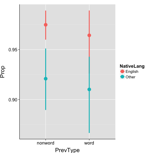
-
note: the y-axis range defaults to the plotting range, not the 0-to-1 proportion space
Barplot with ootstrapped confidence intervals
-
given the subject-wise proportions we just calculated, ggplot can calculate grand mean proportions and plot bootstrapped (non-parametric) 95% confidence intervals
ggplot(data = props.bySubj, aes(x = PrevType, y = Prop, fill = NativeLang)) +
  stat_summary(position=position_dodge(.9), fun.y=mean, geom="bar") +
  stat_summary(position=position_dodge(.9), fun.data = "mean_cl_boot", geom="errorbar", width=.25, colour="black") +
  my.theme

An alternate approach
-
if you want a dataframe containing the grand mean proportions and some measure of variability, calculate these values manually instead of using the bootstrapped method
-
this approach is just like we saw for RTs earlier
-
calculate mean proportion for each condition for each subject
-
calculate condition grand means by averaging over subject-wise proportions
-
calculate std.error (or CIs) over subject-wise proportions, resulting in standard error of the mean
-
then plot (2) and (3) using geom_bar() and geom_errorbar()
- we’ve already done step (1), so let’s proceed to steps (2) and (3)
Grand mean proportion and se over subject means
# calculate grand mean and standard error by native language and previous word
# type
grand.props <- ddply(props.bySubj, .(NativeLang, PrevType), summarise, mean.prop = mean(Prop),
    se = std.error(Prop))

print(grand.props)
  NativeLang PrevType mean.prop      se
1    English  nonword    0.9749 0.00792
2    English     word    0.9643 0.01901
3      Other  nonword    0.9209 0.01875
4      Other     word    0.9101 0.02295
Barplot of proportions
ggplot(data = grand.props, aes(x = PrevType, y = mean.prop, fill = NativeLang)) +
  geom_bar(position = position_dodge(.9)) +
  geom_errorbar(position = position_dodge(.9), width = .25,
                aes(ymin = mean.prop-se, ymax = mean.prop+se)) +
  my.theme

Linguistic Data
Part 4: Geospatial Plotting and Possibilities for Sociolinguistics and Dialectology
The maps package contains lots of geospatial data
# install.packages("maps")
require(maps)

# collect longitude and latitude coordinates for US states
states <- map_data("state")

head(states)
    long   lat group order  region subregion
1 -87.46 30.39     1     1 alabama      <NA>
2 -87.48 30.37     1     2 alabama      <NA>
3 -87.53 30.37     1     3 alabama      <NA>
4 -87.53 30.33     1     4 alabama      <NA>
5 -87.57 30.33     1     5 alabama      <NA>
6 -87.59 30.33     1     6 alabama      <NA>
Plot a map of the United States
ggplot(data=states, aes(map_id = region, group="group")) +
    geom_map(map = states) +
    expand_limits(x = states$long, y = states$lat)

Adjust colors and coordinate space
ggplot(data=states, aes(map_id = region, group="group")) +
    # colour affects border, fill affects state regions
    geom_map(color="#757575", fill="lightgray", map = states) +
    expand_limits(x = states$long, y = states$lat) +
    coord_map()

Read in random latitidue-longitude coordinates
geo.dat <- read.delim("datasets/fakedata_geo.txt", header=T)

head(geo.dat)
   lat  long region group
1 41.6 -80.9   ohio     B
2 42.1 -83.9   ohio     D
3 39.7 -84.2   ohio     A
4 40.6 -82.4   ohio     B
5 39.7 -82.3   ohio     D
6 41.9 -82.5   ohio     A
str(geo.dat)
'data.frame':   323 obs. of  4 variables:
 $ lat   : num  41.6 42.1 39.7 40.6 39.7 41.9 41.4 38.6 42.3 39.5 ...
 $ long  : num  -80.9 -83.9 -84.2 -82.4 -82.3 -82.5 -81.7 -84.1 -82.7 -82.2 ...
 $ region: Factor w/ 10 levels "georgia","idaho",..: 6 6 6 6 6 6 6 6 6 6 ...
 $ group : Factor w/ 5 levels "A","B","C","D",..: 2 4 1 2 4 1 1 1 1 2 ...
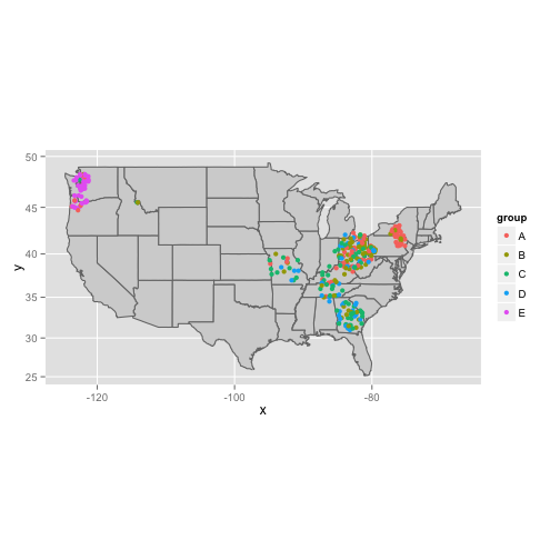
Overlay points on the map
ggplot(data=states, aes(map_id = region, group="group")) +
    geom_map(color="#757575", fill="lightgray", map = states) +
    expand_limits(x = states$long, y = states$lat) +
    coord_map() +
    geom_point(data = geo.dat, aes(x=long, y=lat, colour=group)) # HERE'S THE MAGIC!
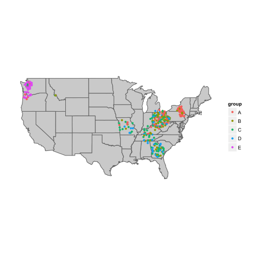
Remove axes and panel background
ggplot(data=states, aes(map_id = region, group="group")) +
    geom_map(color="#757575", fill="lightgray", map = states) +
    expand_limits(x = states$long, y = states$lat) +
    coord_map() +
    geom_point(data = geo.dat, aes(x=long, y=lat, colour=group)) +
    theme(panel.background = element_blank(),  # remove panel background
          axis.ticks = element_blank(),
          axis.text = element_blank(),
          axis.title = element_blank())
Thanks to:
-
Hadley Wickham, developer of ggplot and plyr, for dramatically improving my life as a data analyst
-
The vibrant StackOverflow and GitHub communities for continual inspiration


